How It Works
Pricing
Extensions
Sign In
Create Account
How It Works
Pricing
Extensions
Sign In
Create Account
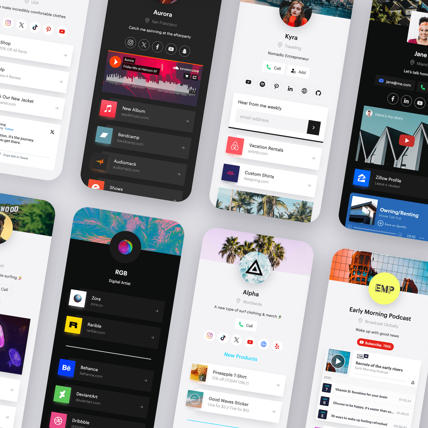
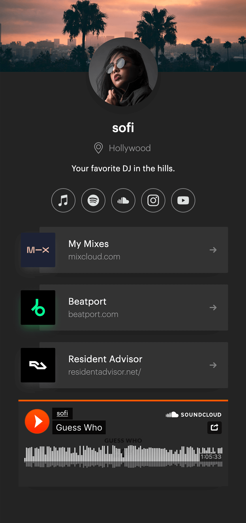
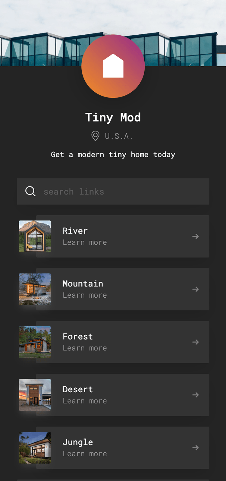
One bio link
for everything
Share and cross promote your links, music, videos, social media, and more on one page.
solo.to/
Your digital world, connected
Unify your social media with one simple bio link.
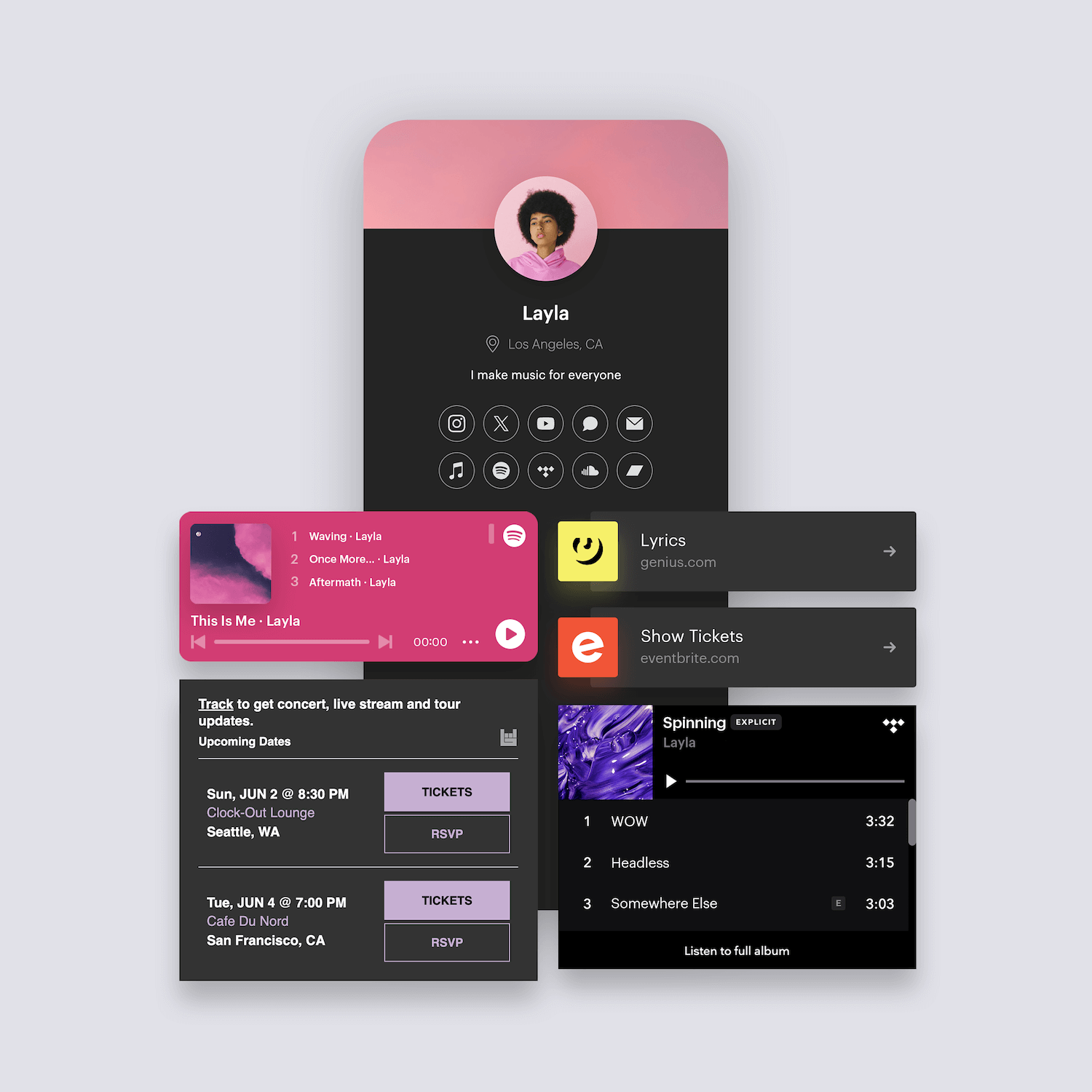
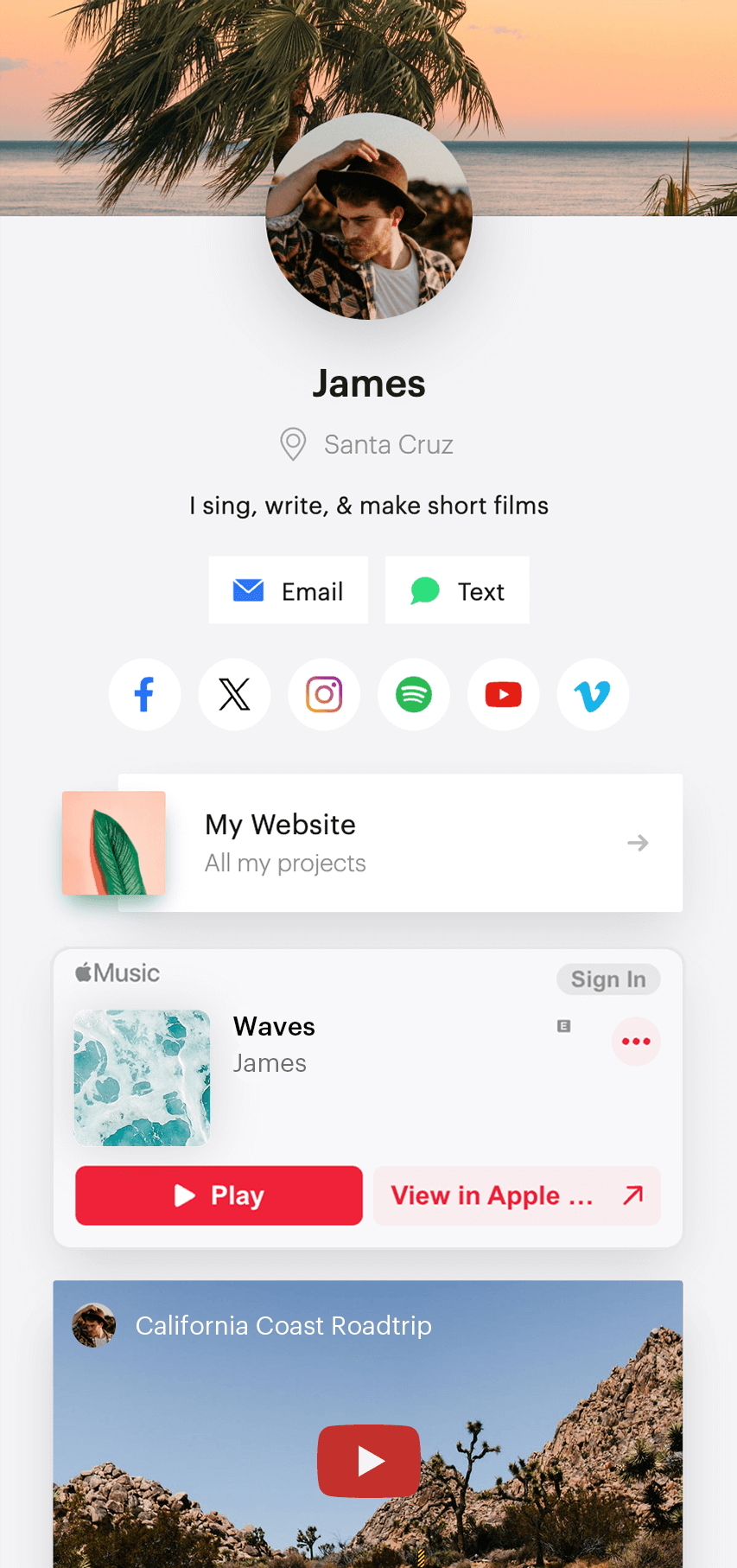
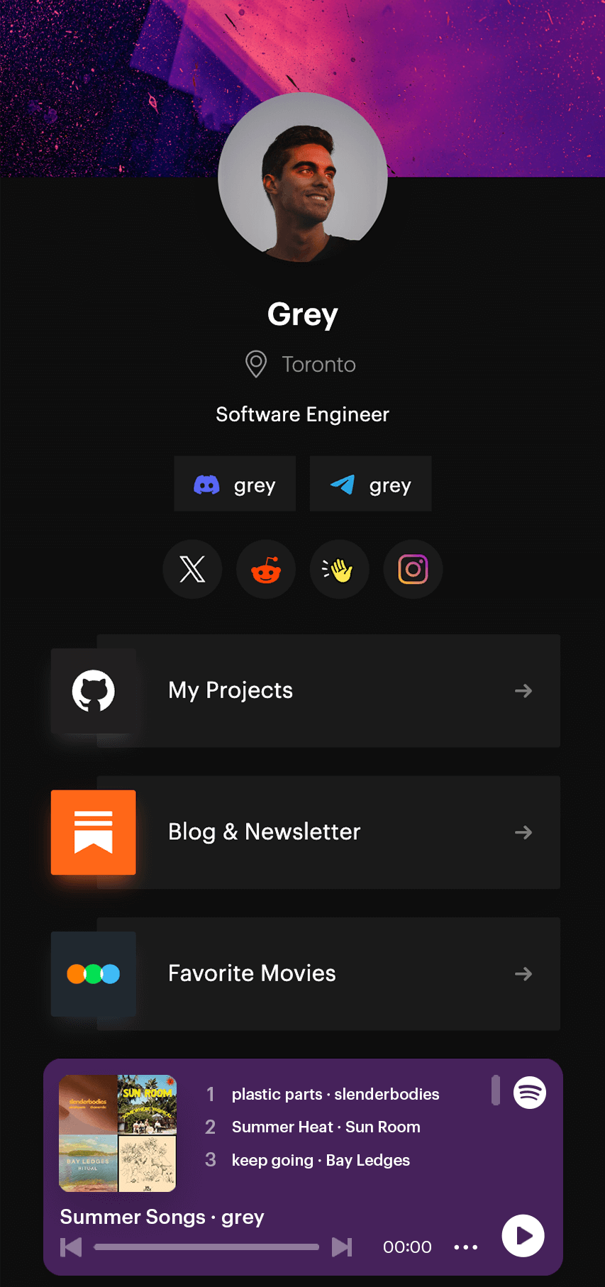
Asher
Let's stay connected
solo.to/asher
Asher
Let's stay connected
solo.to/asher
1.3m
10.5k
4205
Asher
Let's stay connected
solo.to/asher
Asher
Let's stay connected
solo.to/asher
Asher
@asher · 7/7/23
I've had this new song on repeat all day, can you guess what it is?
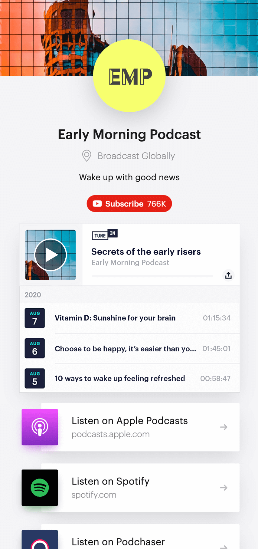
Powerful features made for...
Musicians
Share your songs, playlists, videos, events, and more so your fans can easily connect with you.
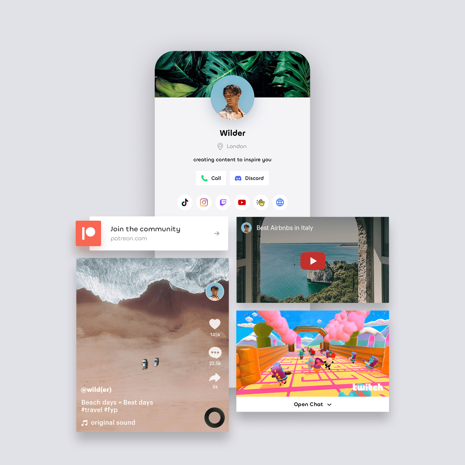
Creators
Cross promote your content and gain new followers across all your social platforms.
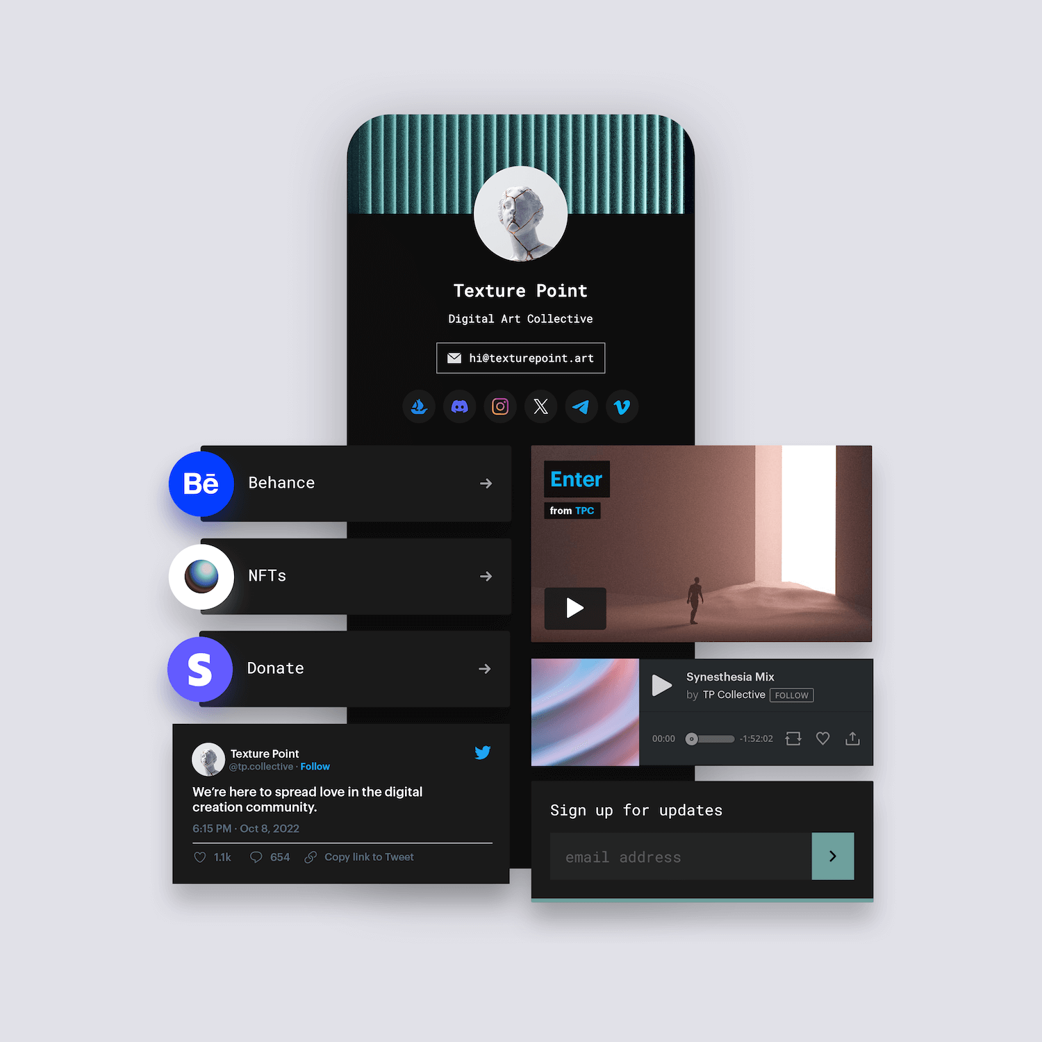
Artists
Showcase your artwork, portfolios, videos, and all the things that make you, creatively you.
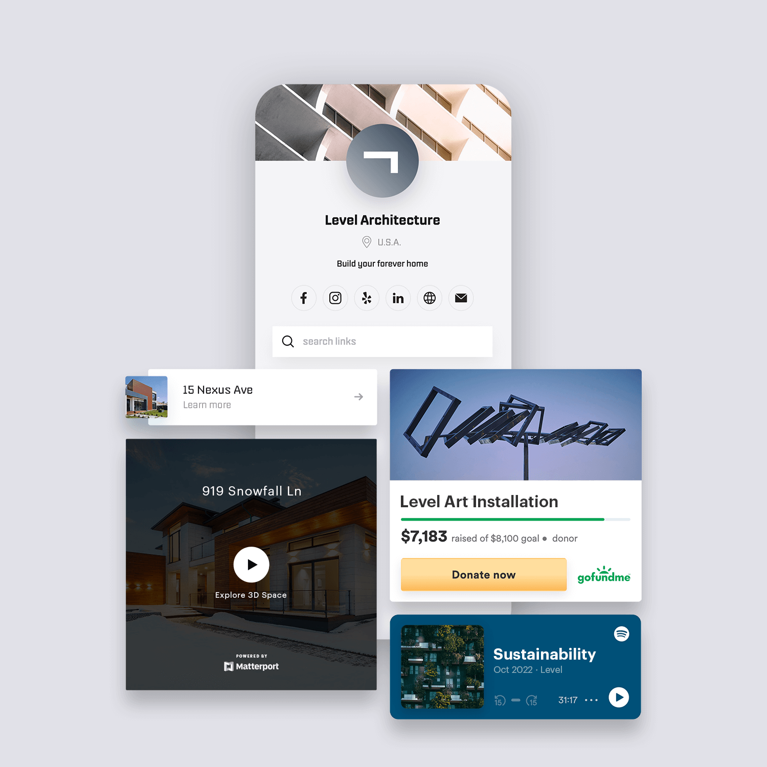
Businesses
Make it easy for customers to find, follow, contact, and engage with your brand.
and many others
Keep your online presence organized in one convenient location with a single link.
Musicians
Share your songs, playlists, videos, events, and more so your fans can easily connect with you.
Creators
Cross promote your content and gain new followers across all your social platforms.
Artists
Showcase your artwork, portfolios, videos, and all the things that make you, creatively you.
Businesses
Make it easy for customers to find, follow, contact, and engage with your brand.
and many others
Keep your online presence organized in one convenient location with a single link.
Juicy M
solo.to/juicym
Hanguk Hapa
solo.to/hangukhapa
Kanishia
solo.to/kanishiafairyhair
ris
solo.to/risris
CHYL
solo.to/chyl
chell.
solo.to/chell
pluko
solo.to/pluko
Bengal Cat Kona
solo.to/bengalcatkona
Ben Salt
solo.to/slt4k
Qrion
solo.to/qrion
Hypey
solo.to/hypey
Melanie Amaro
solo.to/melanieamaro
Get your link
CONCRETE PANTHER
solo.to/concretepanther
GameboyJones
solo.to/gameboyjones
Dayo
solo.to/dayo
JVNA
solo.to/jvna
Morgin Madison
solo.to/morginmadison
Kara Fedrigon
solo.to/karagamii
Kelly Cardenas
solo.to/kellycardenas
Big Pokey
solo.to/sucbigpokey
HUSKI
solo.to/huskibass
Speaker Honey
solo.to/speakerhoney
XayLi Barclay
solo.to/xaylibarclay
CLIFFORD LUU
solo.to/cliffordluu


 1.3m
1.3m